Theming
RadialMenuUI allows extensive visual customization through RadialMenuTheme and RadialMenuConfig.
1. Customizing Colors & Opacity
You can customize the appearance of the wheel background, hover slices, icons, and center text:
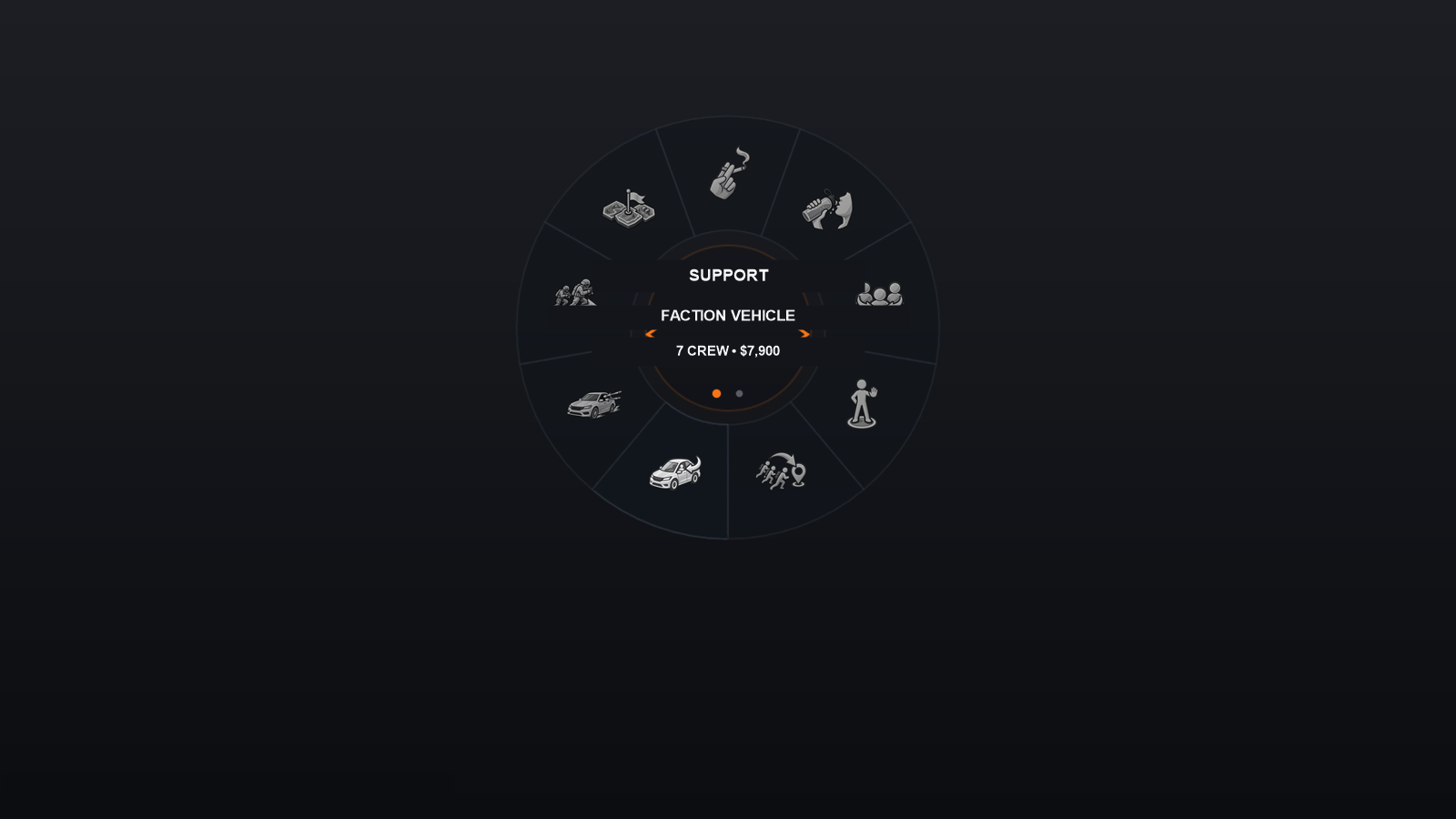
var theme = new RadialMenuTheme("my_custom_theme")
{
    // Wheel background tint & alpha
    WheelTint = Color.FromArgb(20, 20, 30),
    WheelBaseAlpha = 0.85f,

    // Hover slice tint (highlight color)
    HoverTint = Color.FromArgb(0, 180, 255), // Cyan neon glow

    // Icon tints
    IconNormalTint = Color.White,
    IconHoverTint = Color.White,
    IconDisabledTint = Color.FromArgb(120, 120, 120),

    // Center hub texts
    CenterTextTint = Color.White,
    CenterDisabledTextTint = Color.Gray
};
2. Supported Slot Counts
The bundled default theme includes pre-rendered, pixel-perfect geometric ring slices for:
- 3, 4, 5, 6, 7, 8, 9, 10, and 12 slots.
When creating a menu, pass the desired slot count:
// An ultra-compact 3-slot menu
var smallMenu = new RadialMenuDef("compact", 3);

// A large 12-slot inventory wheel
var largeMenu = new RadialMenuDef("inventory", 12);
3. Custom Wheel Art (Base Sprites)
Beyond tints, you can fully replace the base artwork of the wheel ring, the hover highlight and the center hub. Every visual is a plain PNG: textures are loaded lazily by path (RadialMenuAssets.EnsureTexture) — no compilation and no runtime generation.
Skin folder layout of the bundled theme (scripts\RadialMenuUI\skins\default\):
skins/default/
├── segment_8slots.png                    # theme validation reference + single-wedge art template
├── generated/
│   ├── wheel_full_{n}.png                # dim base wheel for n slots (pre-baked)
│   ├── segment_{n}_slot_{i}.png          # hover slice, pre-rotated for slot i (0-based)
│   └── segment_{n}_slot_{i}_runtime.png  # optional slice used when a slot shows a runtime portrait
├── center/
│   ├── center_bg.png                     # hub background
│   ├── arrow_left.png / arrow_right.png  # variant pagination arrows
│   └── dot_active.png / dot_inactive.png # pagination dots
└── icons/
    └── wheel_*.png                       # entry icons (see Assets)
Option 1 — Replace the bundled art in place (zero code)
Drop your own PNGs over the shipped skin, keeping the same names and dimensions. The wheel is drawn as two layers:
generated\wheel_full_{n}.png— the base wheel, dimmed withWheelTintatWheelBaseAlpha(0.65 by default).generated\segment_{n}_slot_{i}.png— the hover slice, painted on top with fullHoverTint.
Textures are created once and cached by absolute path, so replace files before the first render (restart the game or reload the mod), not mid-session.
Option 2 — Ship your own skin folder (per-mod, recommended)
Keep your art in a dedicated folder so it never conflicts with the bundled skin or other mods:
var theme = new RadialMenuTheme("my_skin")
    .WithAssetRoot(@"skins\my_skin")
    .WithIconRoot(@"skins\my_skin\icons");

theme.RegisterIcon("car", "wheel_car.png");
// ... then apply: menu.WithTheme(theme);
BaseDirectory is optional; when empty, the base is auto-resolved next to the DLL or under scripts\.
Geometry constraints
- The full wheel and every slice are drawn centered on the same canvas; the artwork outer edge is expected at ~92.8% of that canvas (
BgArtOuterF). Keep the same outer radius so the hover slice exactly covers the base ring. - Each slice is pre-rotated for its slot index and drawn with rotation 0 — generate one slice per slot at its own angle.
segment_8slots.pngmust remain in the skin: it is the reference file used to validate that a theme is installed.- Supported slot counts are 3–10 and 12 (
RadialMenuDef.IsSupportedSlotCount). The skin must provide the matchingwheel_full_{n}and slice set; 4/6/8/10/12 are pre-warmed at startup, the others load on first use.
If you only want a different look (colors, alpha), the tints from section 1 are usually enough — no new art required.
For icons, textures, and dynamic images, see Assets.